WHIMSICAL. EARTHY. ORGANIC. MINIMALISTIC.
Blooms + Branches Co is the late-nights-and-long-weekends side hustle of a precious mama of three with an eye for family photography and a heart for the souls she captures on camera.
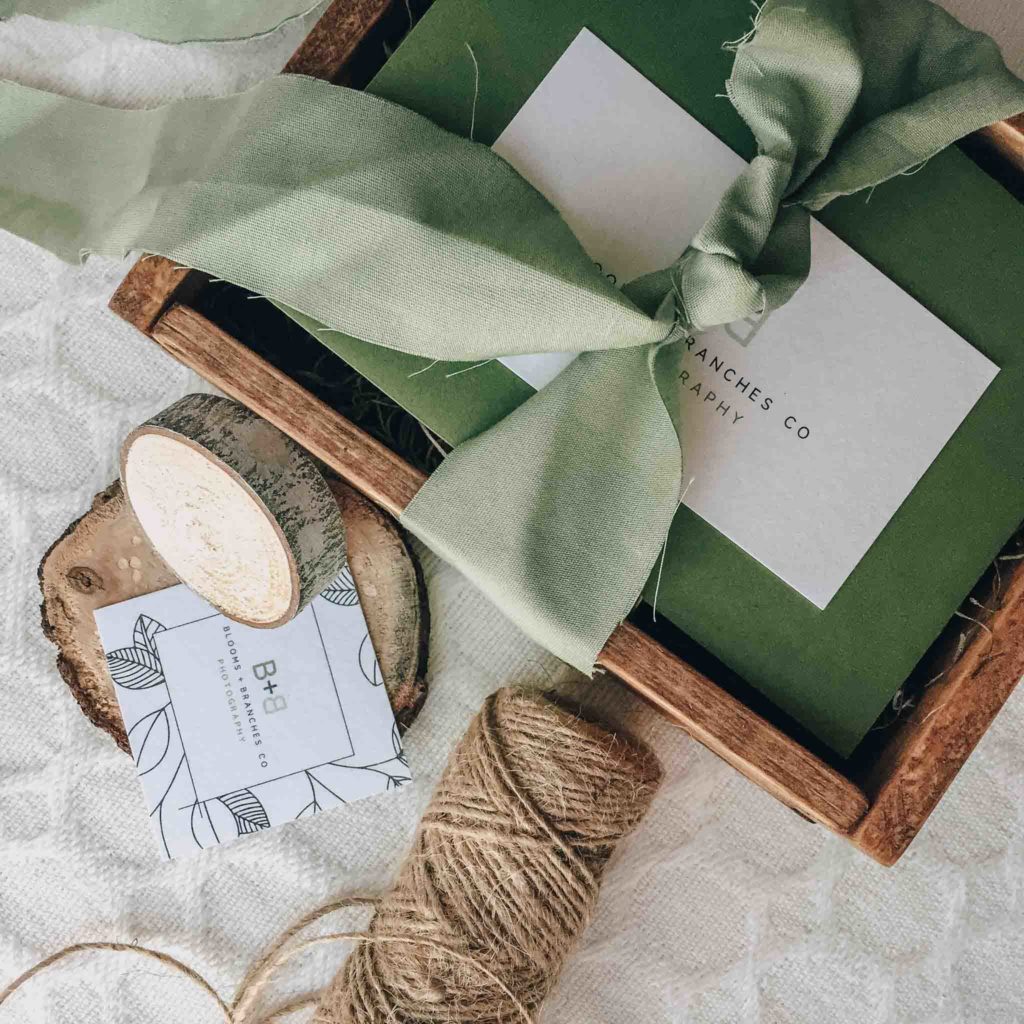
One of her favorite colors is an earthy dark green, which was a natural fit with wood tones and soft shades of grey-green.
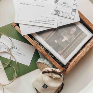
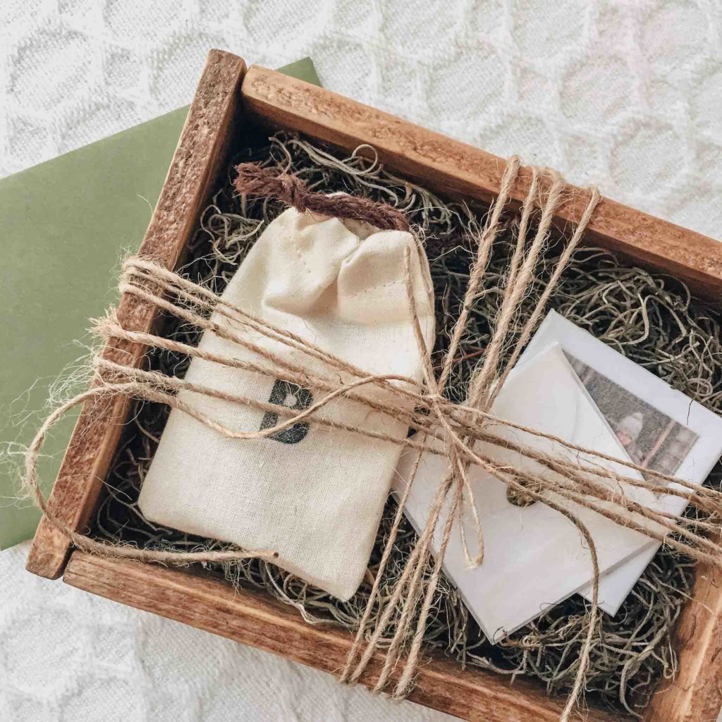
A cotton pull string bag houses a wooden flashdrive with her new logo inscribed on it. I stamped it with a b (for baby an me. jk) and instantly fell in love. The rest of the branding fell into place effortlessly once I saw the cotton bag next to her beautiful green envelope.
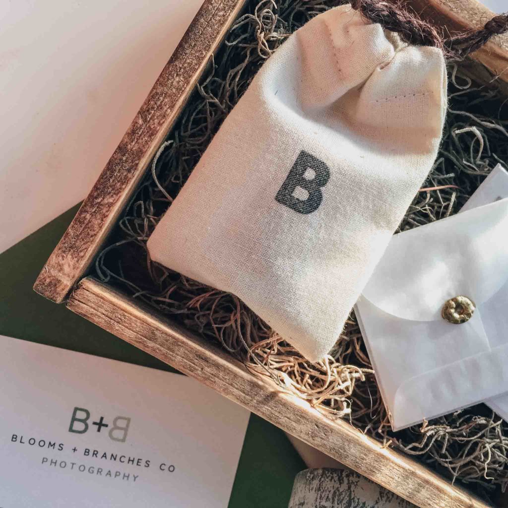
Marshall, my trusty craftsman, built me a box to my exact specifications and we stained it a natural wood tone to bring out the grain and create a centerpiece to house the flashdrive. A little bit of moss ties the earthy tones of the wood and cotton bag together, allowing the green envelope to accent the soft greens in the printed assets.
Her business card is simple and clean, while her promotional coupons are bordered with cute little leaf drawings to bring us back to life, growth, and new beginnings.
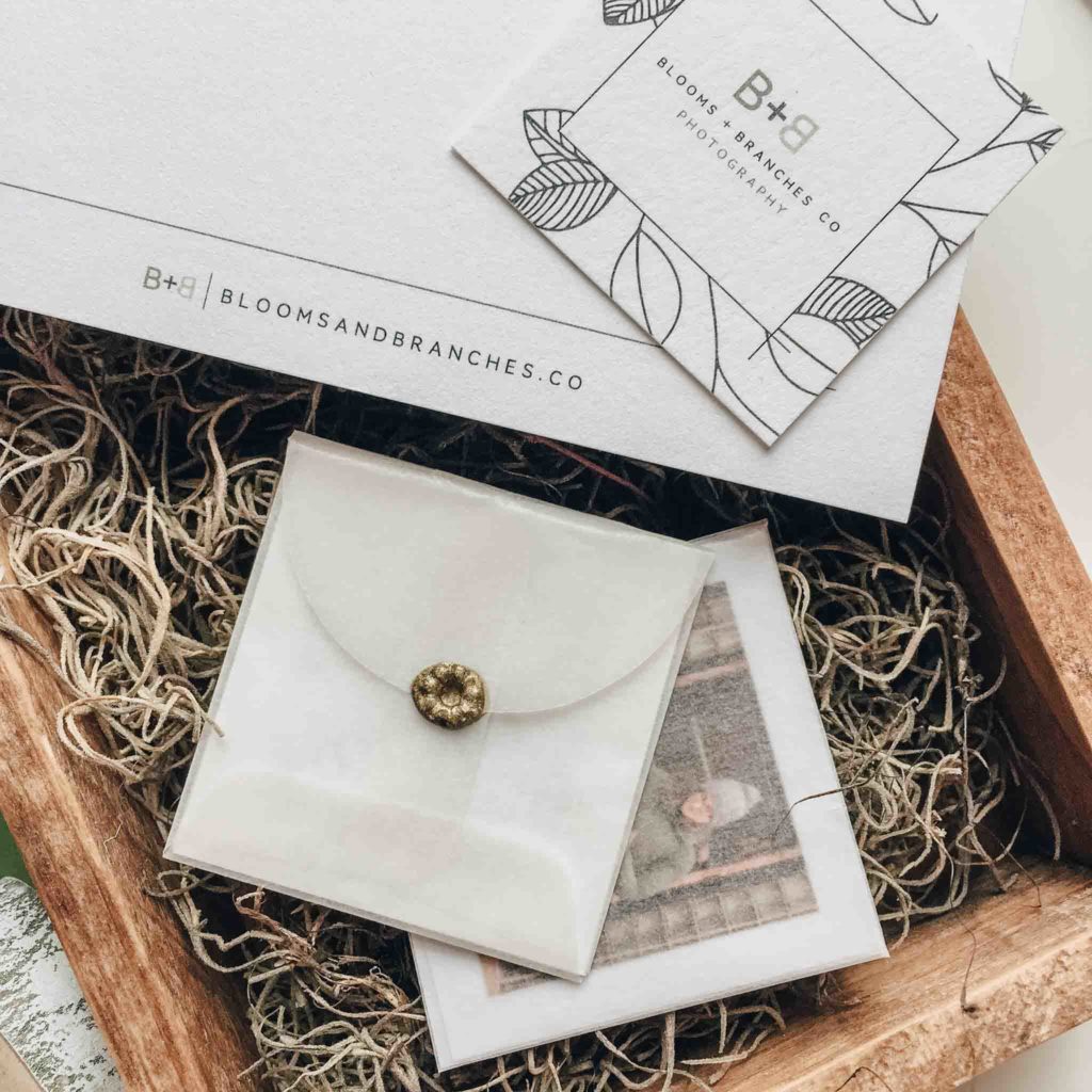
A sweet, handwritten thank you note is slipped into the small green envelope and tucked on top of the package. Rounding out a beautiful photoshoot session are a few of her favorite shots slipped inside a tiny square vellum envelope with a miniature gold wax seal to bring it all together.
Of course the best part was when I slipped the entire branding sample into the mail and surprised her with the pieces she hadn’t seen yet. Bringing to life the wistful ideas tucked away inside someone’s mind is so rewarding and I can’t wait to see the beautiful memories she captures for her lucky clients as she begins her official venture into the world of photography.
You can learn more about Blooms + Branches Co at the website I created for her, or following her on social media. Make sure to let her know how much you love her new look!


Leave a Reply